Dear Mob,
It’s Not Up to You
Logo Theory and Aesthetics
By: Christian Wojciechowski, VP Creative
His name was Terence Reynolds.
He’s one of the greatest creatives in the country and in my early 20’s, I had the opportunity to work with him every day, and watch his genius as he created images and concepts with the ease of Eugene Wright playing an upright in a bar at 4am with three other suit-clad dudes just getting warmed up.
His mentorship meant a graphic that represents a brand must tell you something about that entity without words, but with a story and with as little information as possible. The discussion was not about how, what, and why, but about what can you perceive about the brand with nothing more than some structure, color, and maybe a word or two.
Visual Identity, over time, has become offensive in my opinion but it’s not my place to judge and certainly not yours. It’s funny how the masses are so quick to see the negative and point out the “wrong” with everything.
Would you berate a child for spilling milk?
Would you destroy a teenager’s esteem for a simple crumpled fender?
Then why spit negative to those who don’t know any better?
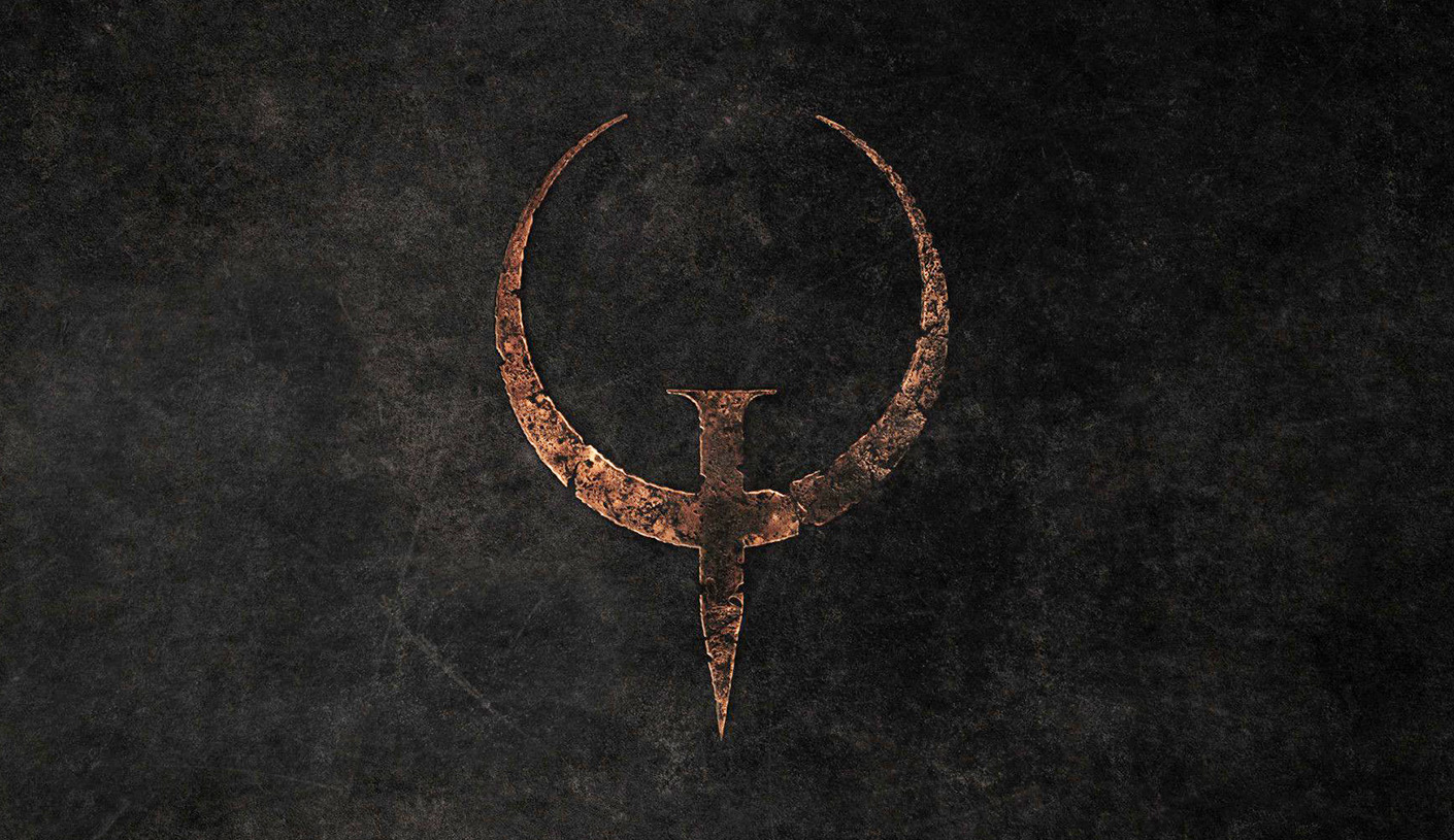
To give context and some expert matter credentials, I’ve designed, art directed, and creative directed quite a few identities with some winning a few awards. The greatest accolade was not from my peers but from the people. As an artist, being voted one of the top 5 gaming logos of all time by the gamers themselves was the greatest feeling in the world. Quake was as epic as you can get. Like seeing Lawrence of Arabia for the first time in that majestic Panoramic CinemaScope… or Shrek. This was my organic phase.
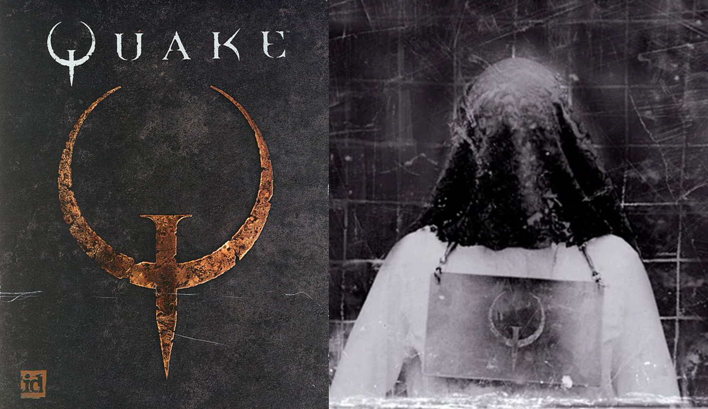
Then there was the era of my serial killer phase where logo design was hands on, literally. Ripping, cutting, manipulating, test after test, late nights that turned into weekends with no sleep and dye-sublimation machines that broke because you tried putting burlap through and the office manager kept wondering why there were fibers in the paper tray every morning. I never knew a logo could be bloody but the story behind the mark leant itself to that conclusion.
Entering my geometrically symmetrical phase, I remember submitting the Jedi Knight II logo to George (we called him “Little G” for short behind closed doors). You might know him from a then unknown trilogy filmed in 1977 that shaped some of the nerds you’ve married later in life and now you have a room dedicated to star destroyers and sand crawlers (and you don’t even have kids). The story within the concept was a boy in conflict with his (spoiler) father and the struggle between good and evil all wrapped up in a mark that was simply a “J”, and a “K.”

Terence taught that you shouldn’t have to explain the feeling the piece was to evoke. His care and mentorship taught me to think, to craft, and to damn well make sure there is meaning in the final mark. The greatest lesson was one he didn’t explain and allowed me to take as much time as I needed to move from the mentored to the mentor.
There’s only one thing that matters when it comes to logo design and theory. Restraint.
Terence taught that it’s not that you could, it’s whether or not you should. (Personally, I thought Jobs got screwed with “next” but that was his 100 grand).
But for the love of all that’s holy, exercise restraint. So now, onto the matter at hand.
Johnson & Johnson: Horrid.
Tropicana: Sterilized.
Pepsi: Just plain stupid.
Kia: Meh.
Smuckers: Horrifically destructive to children.
Jaguar: I’m speechless and it destroyed 100 years of history.
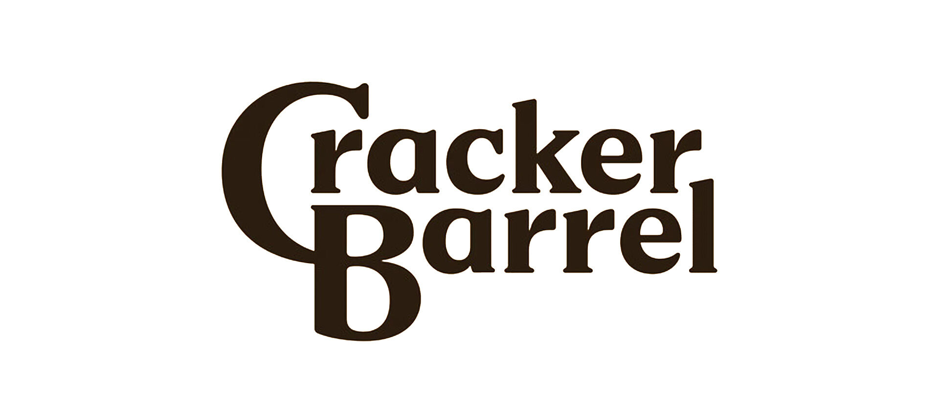
And now, Cracker Barrel…
Consider this; You can go back to the 1900’s and still see the Coca-Cola purity. It’s Americana. It’s beautiful. It works. Show restraint and do little to nothing if asked. It has not changed, and it shouldn’t. It just IS Coca-Cola.
Another great example is John Hancock Financial.
John Hancock has not and will not change that signature. There will never be a need for any modification.
It will live in infamy, forever. I love it.

Cracker Barrel looks like 5 dollars was spent with the greatest of care.
Clean and simple.
If the brief direction was to update the logo to make it more mainstream, then I’ll have to quote my great friend Chit, Success! If the brief was to create buzz around the new look and to get people talking, again, a perfect score. If the brief was to create a new mark that represents the brand in a new way, top marks.
So, my verdict: Don’t crumble. Don’t cave. Just try again.
It’s not my place to judge because I know the mindset of the creative who worked this problem to the best solution they could.
And to mock them and destroy their credit to the effort, shame.
And I’ll ask you to try it.
Redesign the Cracker Barrel logo and send it to christian.wojo@andbarr.co and I’ll give you a professional critique.
My ask to the designer would be to show us round 2 and restraint is the rule.
Some brands evolve; others, like Coca-Cola and John Hancock, endure unchanged.
A Cracker Barrel redesign can work, don’t try to be perfect, be honest. And maybe that’s restraint enough.
I did however like the nod to the barrel on its side. Clever.

